Tuesday, December 5, 2017

Yearbook 2016 - Christmas

Cathy Krenek has a great new kit - or bundle with alphas and more papers- in her store Christmas Traditions


http://store.gingerscraps.net/Christmas-Traditions-Kit.html


Of course I simply had to use this beauty and make the most of getting caught up with the Yearbooks. I'm waiting for the last completed one - for 2013 - to arrive from the printers!

Part of the fun of putting up the tree is unpacking all the mementos from friends in the form of decorations given us over the years. Love the memories they bring!


This kit has a lot more goodies in that I could not pack onto this page.

I did make up a card as well. It is sized for a standard A2 card (4.25" x 5.5") The 'Merry Christmas' sentiment is from Cathy's Holly Jolly kit. I recoloured it a bit to suits the colours in this kit better.


Tuesday, November 14, 2017

Card - New Home

For a 'Congratulations on Your New Home' card, I like to make something that  reflects a bit of the character or surroundings of the new house.

Getting the image for the 'cottage' was a good place to start and I found this one over at TiddlyInks


https://www.tiddlyinks.com/digital-stamps/dream-home-digital-stamp/


and coloured it using water colours and some coloured pencil.


I wanted a card that would be easy to display, but would also fold flat for international mailing and decided on a Z-fold, which also allows me to create a bit of a  'garden' area. It is such an easy design to make and creates great depth and areas for added decorations.


The rest of the images are all old Provocraft stamps that I've had for many years, and keep pulling out of the drawers from time to time. The woodgrain on the inserts is a Heidi Swapp clear stamp bought at Michaels.

The blue sky and green grass was done using alcohol sprays. I really like the effect the inks create and it is super easy to get really nice results. The only drawback being that it does bleed through the paper and card stock like any alcohol based product will.


The recipients loved the card and I had a lot of fun making it. All that's left to do now is go and visit so I can see the new home for myself!

Tuesday, November 7, 2017

Colouring - Magical Jungle

Another one of Johanna Bashford's books - Magical Jungle is a great collection of images to colour.
The paper takes wet media well so I've been using the Inktense pencils, Derwent WC pencils and NeoColors quite extensively. 


https://www.amazon.ca/Magical-Jungle-Expedition-Coloring-Adults/dp/0143109006/ref=sr_1_1?ie=UTF8&qid=1508795989&sr=8-1&keywords=magical+jungle+coloring+book


Some areas in the double spread have pencil layered over the water media. I was concerned that the paper is too saturated to take more water media


This beautiful pattern is done with only pencils. I had thought of adding a background colour when I first started, but I think in the end the white is the best colour for that.


I like the paper in this book. It was the first one to be published using the paper developed specifically for her books. I like the weight of it, the way it takes the media I enjoy using and also the white that is not quite a bright white. It works well as a background colour.


Tuesday, October 31, 2017

Colouring - Dr Seuss

I enjoy colouring in all the books I have, but this is the only one that has me chuckling while doing so. It is a delight to study all these goofy characters up close as the pencil colours the shapes and details. One simply sees so much more than when you are just reading a story book.

We found this one at our local Costco, and decided to pick it up just because it is so goofy and it makes for cheap enough giggles.

https://www.amazon.ca/Dr-Seuss-Colouring-Book/dp/0008216592/ref=sr_1_2?ie=UTF8&qid=1508794816&sr=8-2&keywords=dr+seuss+colouring+book


This was the first page I tried, and soon enough realised that wet media and this paper and not good friends ... but the Crayola pencils play very nicely with the smooth white paper.


This took a really long time to do and the night sky was not quite what I had planned, but many chuckles later and it is still a fun, bright page.


Instead of just adding a load of colour on Horton's page, I decided to spill just a small amount of green onto the left page, with all the attention on Horton.


A landscape of quirky houses...


More pages to come sometime soon...

Thursday, October 26, 2017

Thinking of You - Card


I liked this image from Lili of The Valleyand thought it would work well for an all purpose card.
I took the colour inspiration from some older designer paper I have in my collection and coloured the image with Derwent WC pencils. I find if I leave the digital ink jet images to dry for a few days the ink takes a small amount of water just fine with no, or a very small amount of bleeding.


I used an embossing folder to add interest to the front panel of the easel card as well as a die cut, and sentiment (an older ProvoCraft stamp) and a little bit of ribbon.

I also used dies to cut curved edges on the designer paper strips, on the inside and outside of the card. I added foam under the paper on the front strip to create an edge for the easel part to push against.


I stamped the top half of the card front with Versamark ink and a Friskars rose stamp. I like the way the Versamark ink looks on the kraft paper.


All in all a quick and easy card to make as a reminder to a dear friend that she is in my thoughts.

Tuesday, October 24, 2017

Colouring - Escape To Shakespeare's World


One more colouring book I treated myself to last year was 'Escape To Shakespeare's World' by Good Wives and Warriors.  

I really like the smaller size of these books and the paper takes wet media and softer pencils well.


I really notice more and more that I have a serious colour problem : unless I preselect and physically remove a selection of colours, I will end up using every colour in the box.

Guaranteed.

I used Inktense, Derwent Water Colour pencils, Neocolor pencils (water soluble), and Crayola pencils for all the images here. Crayolas work really well on this paper


I thought it would be nice to have the ROMEO look like it was carved stone, so I drew in some extra lines to get dimension and added cracks and dots for a stoney surface. I also added black ink in the background. I like how the black background makes the colours pop.


A seascape, especially if it has a boat/ship in...well that is always one of the first pictures I will colour. This is such a great drawing!


Now for the unicorn I had thought I would add greens, blues and purples in the background all gently flowing into one another. This is the basic base coat done...and then I liked it so much like this that I decided to leave it. I may still come back and add more colour if I feel like it at a later stage, but for now it's staying like this.


As with all the other books that I have, I have multiple pages on the go at all times it seems. I'll have more to post another time!

Tuesday, October 10, 2017

Family History - a Photo Book

Long time no hear from me!

I did not plan to take a 3 month break, but life got busy and computers gave me trouble....but I'm back!

And today I'm back with another page in the Family History Photo Book. This book has been in the making for many years, and I think by the time I get the pages uploaded for printing, I'll be looking at more than one volume. For now I'm just working away at the pictures. I think I have all the pictures collected in one spot by now though. What a job! But interesting too - no doubt about that!


It's been really interesting to read some of the novels written by a niece of mine, relating the stories of some of our ancestors. In this photograph I recognise some of the people mentioned in the latest book in the series. That is really very special!

I used Cathy Krenek's 'Time For Wine' kit for my page. One can never have too many flowers and when the picture is 'all girl' I have to restrain myself from adding copious amounts of ribbons, lace and flowers! Right now this is available as a grabbag, I'm sure that will change next week. I'll be back to fix broken links by then...

Time For Wine


The Bundle is available HERE  and the kit alone HERE. All the bundle pieces are available separately in Cathy's store

Monday, June 12, 2017

Colouring - Escape To Wonderland

I'm still colouring in 'Escape to Wonderland' by Goodwives and Warriors. I posted the first batch of pages HERE.

Here's a few more pages - I've used a combination of water soluble pencils (Derwent & Inktense) and Crayolas for most of them. I find the paper takes water well, it buckles but not so much as to make the reverse hard to colour. I also find that I prefer the more waxy pencils for this paper. They seem to lay down better than the harder leads do.

This double page spread was quick to do with all the black ready printed. I will add a bit of glitter glue later on when the bumpiness of the glitter will no longer interfere with the colouring of subsequent pages. This stars will need some sparkle, but I would actually like to get my hands on some glow-in-the-dark paint for those.


A riot of colour. The only way I can work in a limited palette is to choose colours and then hide the rest of the box. For this one I just reached for whatever colour I fancied most at the time! I did doodle a frame around the text. Just because.


Tiny areas to colour, so I did a quicky with water colours rather than spend lots of time sharpening pencils


For this Cheshire cat one I was considering giving it a solid black background to make the colours pop. I still think a deep purple or indigo blue background could look really nice with this, but for now I'm leaving it as is. I doodled a basic banner around the text. 


With great effort I kept this 'coin' within a limited palette...


This one was fun to colour! Such a goofy image for a goofy concept - I mean do fish walk on their tails or do they hop?


I intended to lay down a wash of colours and then added pencil over top of that 'snakey Alice' but then I liked it well enough as is and decided to leave it. A sky behind might look nice though and it will hide the faint shadow shining through from the other page next to her head.


A great page for colouring. I like the perspective and the large shapes. Reading that line in a normal voice is almost impossible...


 I hauled out my ink filled waterbrush yet again for the background on this page. Love how it turned out. The black makes all those colours shine. And I used every colour in the box for this one. And then some. Including gold.


And so the fun journey continues in this and other books...


Friday, June 9, 2017

Giant Acorn...

or cute little box?

The other day I just wanted to make something for the fun of it...now I have a tiny little gift box as a result! We had a dry sunny day, sadly so far a bit rare this spring, so I headed outside for a few bright pictures.
The papers are from a Christmas themed paper pack I picked up a few years ago from Michaels. The cardstock is from a Recollections multi-pack


The box is straight forward and easy to put together. Using patterned paper is optional, but I think lining the rounded shape with paper, even be it plain card stock, is a good idea to mimic the smoothness of the nut.


The finished size of my box is 3.5" (9cm) excluding the stem. The total length is 5" (almost 13cm)  At this size I used letter size card stock, but of course one could easily scale it up or down.


The box measures about 2.75"(7cm) in diameter across the opening


It is the perfect size for a small gift of jewelry or even just a little snack. A collection of acorns each containing a different coffee or chocolate, all piled into a bowl would make a great gift. It would also be a practical container for a hostess gift.


 I will definitely have to give that pinecone a try...


Monday, May 8, 2017

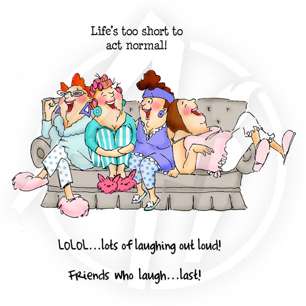
Friends Who Laugh....Last!


Too true... and sometimes all you need is a simple little card to celebrate such a friendship. I used water colours to add colour to the card base and added splatters for good measure. Playing with water colour is so much fun! I also have these little bits of patterned paper left that are too small for a card front, but it was perfect for a pop of colour on the card front. A die cut piece of lace adds a little bit of texture and the sentiment strip gives my laughing friends something solid to stand on. A few sequins added the final touch of fun.

The stamps are from the ArtImpressions 'Girlfriends' collection. The image (that never fails to bring a smile to my face) is from the set  'Laughing'  and the sentiment is from 'Comfy on the Couch'


I'm entering this card for the ArtImpressions - One Layer Ladies challenge. There's just a couple days left to enter, so come on over and join us!