Monday, March 27, 2017

Colouring - 'The Magical City'

Taking a look at 'The Magical City' by Lizzie Mary Cullen this week. I got my book as a gift, but as far as I can tell, Amazon carries it in most places.


I started with this page of 'Baker Street' or Sherlock Holmes, whichever way you want to look at it and found it to be a most enjoyable colouring journey. I really like the intricate line work and the overall design is first class. I started this in the holidays and enjoyed taking my time in colouring all those tiny areas. The paper is quite smooth and white, which makes it great for harder pencils and seeing as the harder ones keep a sharper point I found them a pleasure to use in this book.


For this delightfully quirky version of Bruges I used Crayolas and added some loosely drawn lace to the bottom corner as I simply cannot think of Bruges, but remember the gorgeous Belgian lace produced there.


Trying out the Prisma Colour Scholars on 'Amsterdam' below. I was not planning on buying these yet, but they were heavily discounted and hubby said 'why don't you get them?' I couldn't really find a good excuse (how hard did I try, you may ask?) so I did and although I have not done a whole lot with it, so far so good. They are definitely superior to the Crayolas, that much is obvious. But again, this smooth paper really likes the harder pencils. The wax from these soft ones builds up quickly on the slick surface.


I tried wet media on the paper and it worked well enough - seeing as most of the illustrations cover the whole page, a bit of wrinkling and buckling will go largely unnoticed I think. And it doesn't bother me at all.
For this 'Castle on the Hill' page I used Inktense and Derwent water colour pencils. However I messed up big time on the little stream and surrounding areas, and this was as much as I was able to rescue it and fix the mess. For now anyway. There is no glass for this to hide behind so if I think of something else to try, I sure will...but just look at that nice image to colour! Just looking at it makes me want to pick up pencil and book and colour the afternoon away!

I did add some dry pencil to this over the wc pencil layer (mostly Crayolas) just to add a bit of depth in places. Once the water media dries, the paper has basically no tooth left, so there is not a lot of detail one can add with dry pencils.


I'm busy on a few more pages in this book, so we'll revisit it sometime in the future.

Wednesday, March 22, 2017

Floral Fresh Greetings

A little birthday greeting for a friend - another spring birthday!

This time I used the 'Summer' digital stamp from Lili of The Valley.

For this card I decided to remove the outer frame/border all together for a more 'open' look. Instead I blended some pigment inks onto the edges of the card to act as a frame.


The image was coloured using Derwent water colour pencils and colour pencils and I added a variety of die cut and punched pieces.


I used tiny flower punches and floral sequins as embellishments so as not to overwhelm the beautifully delicate sketched digital image.


For the polka dots on the dress, I mimicked the dotted designer paper using Tulip dimension fabric paint. Only do you see that squiggle on her shoulder? That was a mistake...the paint leaked out as I was getting ready to place that first dot! Yikes! I decided to leave it. It almost looks like it was intended to look like that!

All I can say is that if you're going to make a mistake, this is probably the best kind of mistake to make!


I bought the whole set of Seasons Girl digital Stamps and look forward to colouring the rest of them.

Monday, March 20, 2017

Colouring - Alice in Wonderland

Ever since I first read it, the stories of 'Alice in Wonderland', and 'Through The Looking Glass' have amused me (I cannot say the same of the recent, and few years older movies based on the characters - but I shall say no more about that here) What amuses me is the seemingly randomness of the connections and the crazy reasoning she get's up to in the stories. Reminds me of the sort of thing that happens in my dreams.

Naturally I was interested to try the 'Escape To Wonderland' colouring book by Good Wives and Warriors. I got mine from Amazon. And although I cannot say I like every single page, I certainly like the majority of them and am enjoying the process of colouring the story in sequence, which I thought might be a different way to go about it, rather than the random way in which I colour through other books.

I took the book and a pack of 24 Crayola Pencils (I know right?!?) with me when I traveled last year and I had a blast. The pencils performed beyond what I expected, and together with a 12 colour set of water colour crayons (Caran D'Ache) I was set for any picture in the book.

The title page - I did this one before leaving home to experiment with different media and pencils to see how the paper would handle it. I really like the paper in these books. It is sturdy, and off white, takes limited water well and stands up to some rougher treatment just fine. I also like the size of the book, which was a deciding factor in my taking it along while traveling.


This double page spread is so far definitely my favourite page. I think the design is outstanding and all those flowers were a joy the colour. The solid black background really makes those colours pop. I often add a very dark or black to the background of a page, and really have to watch myself that I don't do it too often


Here is a page was done using the water colour pencils - sometimes I just need to get away from my usual bright, saturated colours. I also find it much easier to do the details with a brush than to have to continually sharpen pencils to get into those tiny places.


Here's a good example of a page that was a 'groaner' and I might never have coloured it, had I not decided to do the book in sequence. Now that it is done though I really like it and I must admit that it was indeed enjoyable to do. - Just look at that waxy crayola shine at the top!-


The 'Bayeux tapestry' double spread was a great page to colour...I did use quite a bit of gold gouache paint on this one. I would have liked to add more layers in the back, but the paper had had enough at this point, so I had to move on.


I'll be posting more finished pages at a later date. I'm halfway through the book and still enjoying the journey. I seem to be much faster at colouring than I am at taking pictures....

Friday, March 17, 2017

Yearbook - November 2014

I am still quietly plugging away at the yearbooks. It is such a treat to have one printed. I don't know that I will ever get used to the thrill of paging through these and enjoying the memories all over again. I have also found them to be very useful for questions such as : " when did we...?" I've solved many a mystery along those lines by pulling a photo yearbook off the shelf!

2014 is close to finish now, just a few more pages to go. Here is one of the three pages for November -


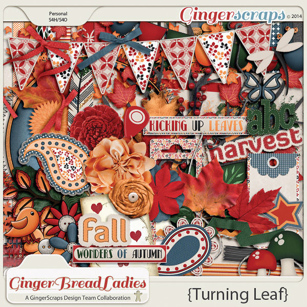
The alpha for this is by SeatroutScraps over at GingerScraps. It is a free gift as part of her monthly challenge  'A Year of Blessings'  There is still time for you to get the alpha and use it on a page to earn a point towards the monthly kit. (complete 10 challenges = earn a free kit. I really like that the points can be accumulated over months, so that if you cannot complete all 10 in one month, you do not loose your progress. For me that is a big plus in taking part in challenges)

The kit is 'Turning Leaf'  an older kit, but I'm such a 'sucker' for those colours and it suited my page so well.


Wednesday, March 15, 2017

Spring Time Birthday

There is something very charming about a birthday in spring. Maybe because mine is when everything is very grey and very foggy, still...there is something about new flowers and birds singing that seems to make it a suitable time for a birthday.

I decided to use a Lili Of The Valley digital stamp for my 'spring feel' card. The one used for this card is called 'Spring'

I separated the frame from the image and also erased the leaves that come down from the top of the frame in the original image (see HERE) because I wanted to add a little dimension by including die cut and punched flowers. I copied the butterflies from the 'Summer' digi image (HERE) and added those around the figure.

The frame is popped up on foam tape for dimension and it also gave me a place to attach the banner greeting (best wishes)


A tiny bit of glitter on the butterfly wings and the headband finishes off the image coloured with Derwent water colour pencils and colour pencils. I also added tiny floral sequince and half pearls to the punched flowers at the top.


The easel card format allowed for the rest of the greeting to be displayed as well.

That pretty cool font used for the greetings is a free personal use font, called 'Pea Anna Banana'

I hope the card travels safely across the oceans...

Monday, March 13, 2017

Colouring - Secret Garden

Of course I had to try Johanna Basford's colouring books, so when I saw 'Secret Garden' at my local store last year, I picked up a copy to give it a try.

I must say that her art work is of the highest quality and I am really enjoying this book.

This double page spread was the first pages I completed - within days of buying the book, I must add...


I used this colour swatch - just love these colours! You can find this one and lots of palettes over at Design Seeds


I basically looked at the pencils I had available and found colours to match as closely as possible. I ended up starting with Derwent Watercolour Pencils, and layering dry pencils over top. Except for the Derwents, most of the pencils are so old, they are no longer available. 


I had a hard time taking a clear enough picture of this page, but you get the idea - I hope.


I added a light line of silver Sharpie marker on the bee's wings. The Sharpies bleed through so one needs to move fast and draw lightly.


I also added a bit of glitter paint to the wings. It is an iridescent paint made by FolkArt. It is hard to capture on camera because it is so subtle.


Finally I added some colour with the water colour pencils to areas in the background. The paper takes water colours remarkably well. I did use a water brush which is not very wet and I also find that over time the slight buckling of the paper flattens back out again. I was very glad for that as I really like working with water colour.


I have quite a few more pages done in this book and I'll be posting more in the future.

Friday, March 10, 2017

Visiting With Family


Oh my...those were the days and the memories! 1978 almost wants to seem like a life time ago.


I used an Easter themed bundle 'Egg-Citing Easter' by Cathy Krenek for this page. The picture has such an odd selection of colours that I was glad to find a kit that would co-ordinate with it all!


Wednesday, March 8, 2017

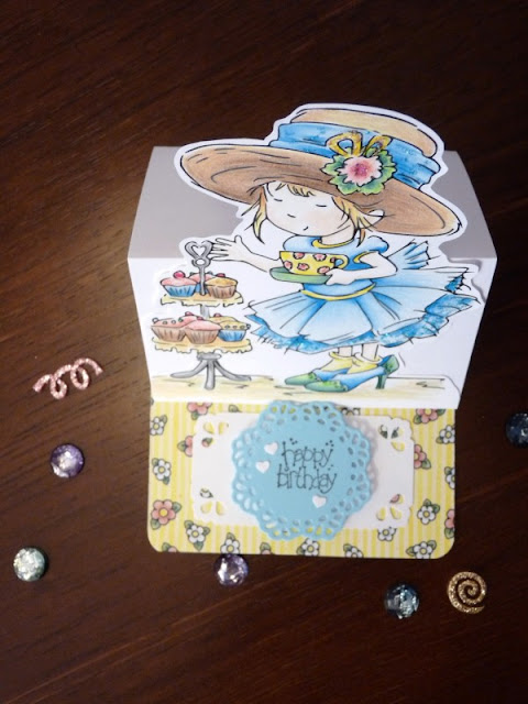
Birthday Girl

Something about this little girl reminds me of myself when I was little. Only of course that little dress would have been the worse for wear were it on me...sitting still and staying out of trees was not my strong point.

I got the image at Lili of The Valley. At the time it was a give-away on their Facebook page. I cannot locate it on the website though, so maybe it is no longer available, but there is still loads of others to choose from (and at this posting all are on sale)


I coloured the image using coloured pencils, using colours to match the designer paper (from an old Provocraft pad)


I die cut a little doily for the sentiment and popped it up with a bit of foam tape to give the easel something to kick against.The die is from an Art-C set Doilies and Lace, that I picked up from my local Michaels


And finally a bit of glitter in a few places to make this festive for my little friend on her birthday.

Looking at the close-up I see that it would be good to just retrace those lines on the facial features a bit, so they will be solid black once more, and the card is ready to go in the mail!